What Is The Best Way To Tell Your Business Stories With Graphs and Charts?

Businesses today are demanding the use of data to achieve a competitive edge. And yet, all the data, statistic in the world will become useless if your partners can’t understand a thing of your analysis. In that case, you may have made your graphs the wrong way, somehow. But that’s okay, since we’re here to seek the answer for your dilemma – Let’s check out the top 7 best ways to present your data with diagrams!
1. Choose the Right Diagram
If you can’t even identify what the usages of each graphing type, you may pick the wrong type to illustrate your statistics and easily ruin your whole presentation. So, first things first – choose the most appropriate diagram for presenting your data.
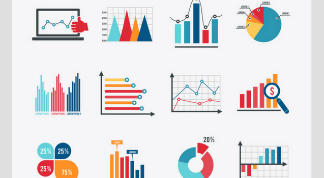
A graph should be carefully selected so that it can convey fully the message from your statistic presentation that you want the viewers to take. Here is a quick explanation for 4 commonly used graphs:
Line Graph
When you want to demonstrate trends over constant space or time, pick line charts. With line graphs, you can also emphasize certain points if there’re significant things happen.
Bar or Column Graph
Bar or column charts are quite similar. They share one thing in common – to highlight the differences between items, and so can be used interchangeably.
Sparklines
Consider using sparklines if you don’t have much room. Sparklines are a small chart contained within a single cell of a table. This graph type often used for showing data trends and can be combined with bar charts within a data table.
Pie Graph
This type of diagram is best to employ when you want to compare percentage segments of a whole. They don’t show differences over time, though. So be very careful.
2. Highlight the Importance
The Similarities
Just as you can highlight the differences between statistic points, a graph can also catch people’s attention due to its similar points among categories. So remember to make these relevant features stand out. It can become particularly handy whenever you need the data to be put into perspective, or that when the similarities might be a bit too subtle and so not be noticeable instantly.
The Message
When people look at a graph, they don’t see all of the information at once. Instead, their eyes focus on one most prominent point. That’s why the professional data storytellers often take advantage of this rule by drawing graphs and diagrams with one clearest message that is emphasized so that viewers can effortlessly digest.

3. Make Your Graph Independent
Never forget to label your graphs or charts properly. A large number of your spectators are most likely to glance at an article to simply read the graph general layout before moving on to the next prominent features.
Here’s a piece of advice, you should design your graph in such a way that it can stand on its own, and make this your rule of thumb always. If you’re not sure yet, label each point clearly, add a descriptive subtext and heading, and source your statistic directly on the graph.
4. Opt for Accuracy
While graphs are effective means for narrative, they should be useful – this is the most important rule. Always remember that an informative and well-organized diagram with precise data will reinforce your presentation. Whereas, a graph that displays inaccurate or misleading information can ruin your credibility.
5. Show achievements
Graphs are a good way to show the milestone your company has accomplished (e.g. monthly sales, number of followers, etc.). It is already a huge impact on spectators when they hear you say it aloud. But it would be even more so if they can see it in the concrete form of statistics in your graph.
6. Be Careful with Numbers
Simple Formatting
Not everybody likes numbers like analysts. Many of your spectators may get overwhelmed by figures, data, graphs. So make your graph friendlier with viewers by avoiding having them count zeros in numbers (e.g. 4000000; 600,000,000). Instead, try using alternate options (e.g. 20,000 ➔ 20k).
Right-Align Numbers
In many solutions, “Right-align columns of statistics always” is the default, but not all the time. What this option allows is for your figures to structure a “quasi-bar chart” by the number of characters. Viewers can scan and skim for the biggest figure with this “quasi-bar chart” easier compared to when you center-align.
Omit Unnecessary Decimals
More often than not, excessive decimals come from confusing accuracy with precision, for people think that the more decimal places they include in the graph, the more precise it’s going to be. This isn’t always right though. Because decimals are really important to include only when the statistics of the data are exceptionally close.

For instance, all values are within a narrow gap of 1-2 percent from one another (e.g. 9.995, 9.997, etc.). Otherwise, if the values spread from 2 – 90 percent, your graph probably requires only two decimals places.
7. Be Culturally Thoughtful
It goes without saying that people are led by cultural conventions. You may not even realize it, but there are actually certain conventions we have taken for granted. For instance, we all know by instinct that in Western culture it goes from left to right when visualizing time, not the other way around. Another common example is that we often interpret red means hot while blue means cold.
And the same applies to visual metaphors – as we all connect a scale to a comparison of two different items, or a pyramid to hierarchy, etc. If you don’t take these conventions into account, then the obvious result is that your visuals won’t be making much sense.
Final Words
After all, what really matters is how to design a graph that can make more of an impact on the way you tell your business story. Let’s us know how you can do that by leaving your comment below. We always appreciate your contribution. Thank you and see you in our future posts!